
Same same but different
As design has grown to be everywhere, in all we use – eat – wear – you name it, it has become a part of us. Design is used to define and manifest culture, is supposed to navigate us in a world full of information. The insights that the Gestalt-psychology has postulated give the designer the chance to play with the perception of a product. These days this product can have many forms, but to me it seems logical to devide them into two main groups for now: the digital and the analogue. Within the two similarities can be spotted amongst the subcategories.
“Use in design”
“The gestalt laws are used in user interface design. The laws of similarity and proximity can, for example, be used as guides for placing radio buttons. They may also be used in designing computers and software for more intuitive human use. Examples include the design and layout of a desktop’s shortcuts in rows and columns.”
(www.en.wikipedia.org/wiki/Gestalt_psychology#Use_in_design)
Of course this is a quite simple explanation to what the possibilities are that make good design so incredibly sexy to not only the designer, but to a target group.
The next question that arises is how to use the introduced concepts in a way that would be genuine and true. Concepts that would think outside of the box. A lot of design at the moment in both the virtual and the physical seems somewhat lazy and is, in my eyes, too little experimental. To me there is more to be won in the sense of user experience than what we get at the moment. Maybe it is not as “slick” or “beautiful” at first, but who cares.
In graphic comunication it is about more than just to make something look “good”. My passion for the graphic field is based on a passion for visual order. I myself like to remember things by using mnemonic rhymes or storylines. I think of a good flowing design in the same way. It has to consist of many layers combining the concept, the psychological concepts of perception and the intention of the subject that is being designed.
Don´t get me wrong, I love a lot of design. And I know that different design fullfills a different purpose. Yet, the psychological & conceptual part is what triggers me the most.
———————————————————————————————————————–
An experiment in reengineering


——————————————————————————————————————————————-
DATA

“Processing is a flexible software sketchbook and a language for learning how to code within the context of the visual arts. Since 2001, Processing has promoted software literacy within the visual arts and visual literacy within technology. There are tens of thousands of students, artists, designers, researchers, and hobbyists who use Processing for learning and prototyping.”
I am interested in how data looks. And by saying that i don´t mean diagrams and tables i mean what the data looks in an interactive yet artistic sense. By defining borders within the code the data defines the visual outcome. It is very interesting how imagination and actual outcome overlap or differ.


———————————————————————————————————————–
2016 – Identity FRANK MOHR XMAS DINNER


———————————————————————————————————————–
2017 – RISO print experiments @ GRID Groningen

———————————————————————————————————————–
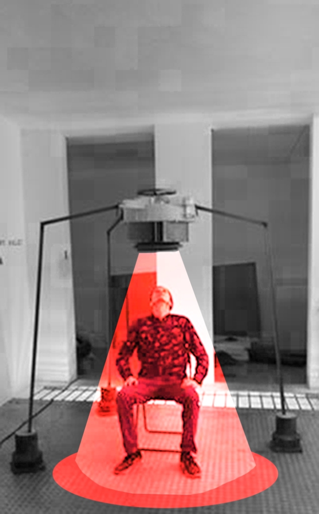
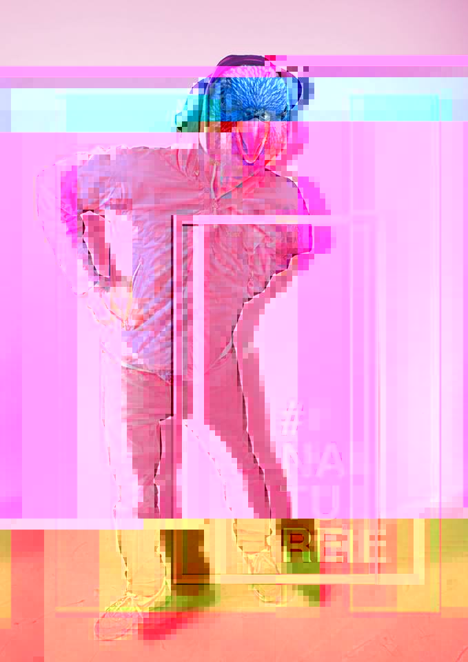
2016 – Identity Open Day @ the Frank Mohr Instituut Groningen 2016 with Nanda Janssen


During a weeklong Projectweek, we discussed among the students of the Frank Mohr Instituut, if the “white cube” was the best presentationform for art and what our thoughts towards this proposal were. We came to the conclusion, that an alternative to the white cube concept is needed, but werent able to come up with a consequent solution to the “problem”. The white cube concept feels like an agreement between the art and the money. A space like a church, where transaction becomes cultural investment.
We decided to turn this world around and made an exibition in which we showed all of our “stuff”. All the little or big things that surround and influence the artist on a daily bases. Old works, work in process, materials, things for later, things for never, and, and, and…
———————————————————————————————————————–
2014 – Concept Development for a self sustained follow up workflow. Project made together with Hanna Wolff.


———————————————————————————————————————–
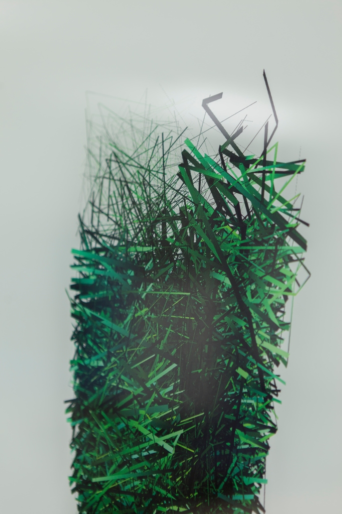
2015 – 2016 – 52°53’NB 7°06’OL & 53°14’NB 6°14’OL
I participated in a talent development program of the “Centrum Beeldende Kunst Groningen (CBK Groningen)” in assignment of the state of Groningen.
The task was to create 2D works about two tiny places in the state, in order to hand in the newly remade conference rooms with the according names.


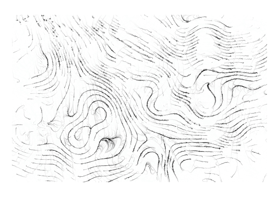
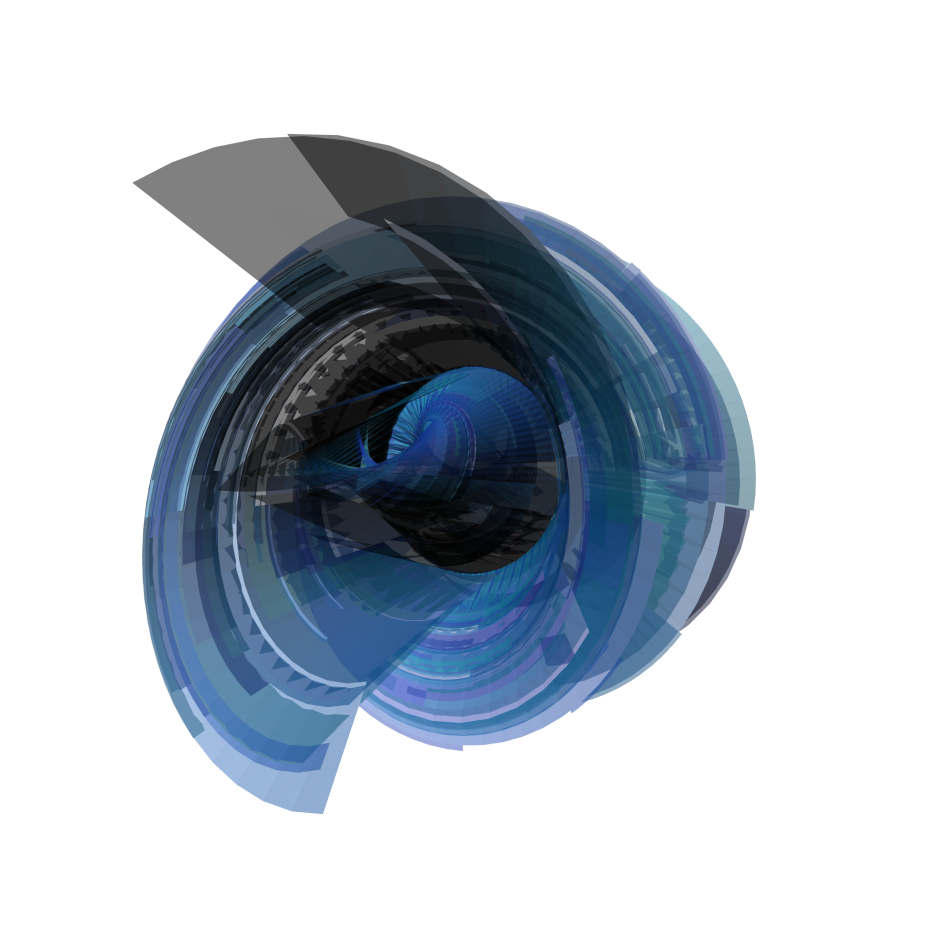
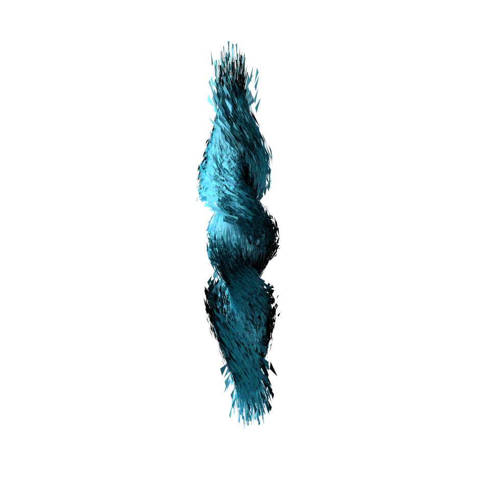
I interpretated the places according to found data. I made digital images using Processing 3 (processing.org). For each place I developed two images in form of a landscape and a totem.
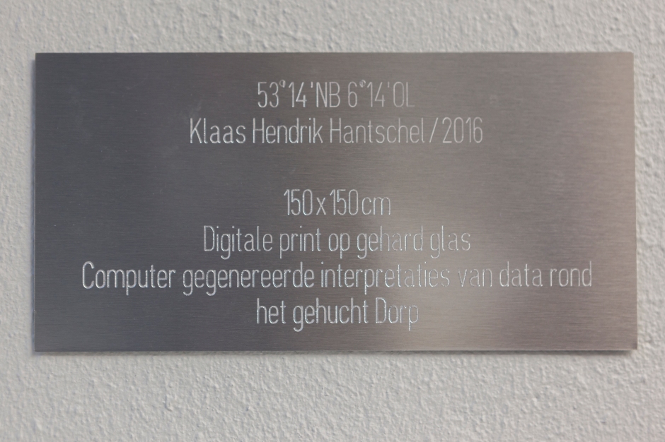


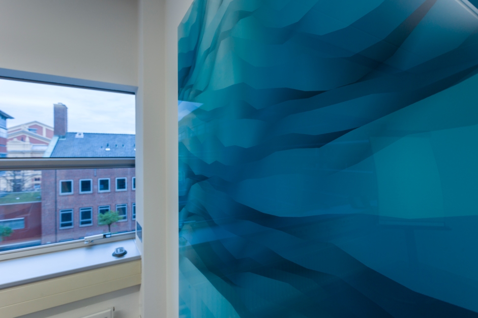


I tried to capture the splits between the digital and the analogue, the new and the old, as I felt this conflict discovering how little and almost from another time these places were. I wanted to capture the fragility by printing on glas. Capturing the image in time and space.


———————————————————————————————————————–
Timeless – Own Documents


———————————————————————————————————————–
Timeless – Presentations


Graphic design for presentations (example). Visual communication as storytelling tool. Visualisation and auditory input as a tool for better memory in recipient. Presentations using homemade visual guidance.
———————————————————————————————————————–
Timeless – In Betweens


Cover Illustration for MZZL! the magazine of the Synagoge in Groningen.
Flyer design for invitation to the presentation of digital paintings I made for the government of the province of Groningen.
Flyer design for group expo OMG//OsmosisMethodsGroningen @ SIGN, Groningen.
Event design on social media, nice tool to practise every once in a while
3d design of random encounters
mixed media design. Production by digital / non-digital interaction.
